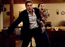
The message director Bryan Bertino seems to be implying in The Strangers is not to misuse technology; doing so can get you killed. Two misused cell phones, one misused house phone, and a misused car and ham radio later, he clearly illustrates why in this latest iteration of the home-invading stalker movie. With similarities to 2006's European Them, Bertino's masked assailants lay siege to the desolate home and psyches of an already distraught couple, entering the premises at will and often standing quietly in the background watching their freaked-out victims, Kristen (Liv Tyler) and James (Scott Speedman).
After his marriage proposal doesn't go the way he anticipated it would, James and Kristen head to his family's vacation house at four in the morning. With red rose petals strewn across the bathtub and bed, and a bottle of champaign less chilled than the soured marriage proposal, both try to reconcile the awkwardness by getting frisky instead. Of course, as you and I know, any hint of sex in a horror film spells trouble with a capital T. Right on que, a nerve-rattling pounding on the front door ends their reconciliation. Outside, a Squeaky Fromme-voiced girl, her face hidden in the darkness created by an unscrewed porch light, is looking for someone. Maybe it's me, but how can James not get a clue even when he screws the porch light back in after the girl goes away? Clueless victims in horror films make matters much worse, as you and I also know.
 An empty pack of cigarettes sends him driving to the corner store for a refill, but the corner store is miles away, leaving Kristen all alone. Let's recap, shall we? A really creepy girl shows up at the front door asking--in a very creepy voice-- if some guy they don't know is home. Oddly enough, the porch light is unscrewed so her features are hidden in darkness. Oh, and let's not forget the incessant and really, really loud pounding that preceded her appearance: a pounding such a diminutive girl could not have possibly done on her own. Do you see where I'm going with this? apparently James doesn't. Maybe Kristen is right in not marrying such a dope.
While he's away, little squeaky comes back, more annoying and creepy than before, with more threatening pounding on the front door. Bertino adds a subtle shifting of the camera, right to left, left to right, as it focuses on the unsettled Kristen, reflecting her growing distress. Then the misuse of technology begins.
Instead of calling the police, Kristen calls James--you know, the dope who left her alone in the first place for an expensive pack of cigarettes. Oops, should have charged that cell phone. She plugs it in and goes for the house phone instead. Not much luck with that either. Gee, I wonder why? Technology can be such a bother when making a horror movie. Isolation is essential when creating the right mood and increasing helplessness. You can't have good horror if potential victims can make quick phone calls for help, or jump in cars and drive away from trouble. Better to make sure they're remiss in using all that life-saving, help-bringing, techno-crap; best to eliminate it right away, leaving them powerless. Dead batteries and poor cellular service are two ways to squelch this cell phone empowerment dilemma. Bertino uses them and more in nice, too-easy, techno-swipes enabled through poor decisions, as the strangers silently hover, surprisingly close, in the background, taking full advantage of James and Kristen's shattered composure and wilting thought processes.
James returns, but leaves his cell phone in the car. Even after Kristen explains the weird things happening, the crazy noises, and stuff in the house moving from where it was left, he's slow to realize they should be driving off like the devil was shooting white-hot flames after them. When he does decide it's time to leave, his car is tidily put out of commission, sending them running back into the house where their attackers can enter at will.
In desperation, James remembers the gun. In the best argument for the NRA put on screen, he fumbles trying to use it, load it, and aim it. The axe chopping through the front door adds a sense of urgency, so he figures it all out pretty quick and shoots. Unfortunately, he misses. But he does have a shotgun and lots of shells, right, so they're safe now. Let the intruders come. He's ready. Sort of. Then again, no, not really.
The home invasion continues, and James and Kristen continue to work against each other and misuse any technology they come into contact with that could possibly help them. Bertino's grim, helter-skelter-styled, 1970's-toned, stalking-slashers-treating-you-bad "because you were home" directorial and writing debut relies on the usual dodges--unwise separation, getting yourself hurt when you can least afford to, and mistaken identity--but through his "uneasy" camera, use of music and loud, incessant, irritating noises, and the movement of his three masked intruders inside and outside the home, builds the terror and suspense. Roger Ebert would have given Bertino one star but upped it to one and a half when he found out this was his directorial debut. I'll go one better and say he's earned two stars for mixing tried and true formulas into an effective thriller. The Strangers will make you double-check your door at night and sleep just a bit more uneasily, even with the lights on--and keep your cell phone charged and close by at all times.


Iloz Zoc
Like The Ruins I saw your link here at IMDB as I was trying to update my own review there. So that site does work I guess. I have over 6 in the queue though. I guess it is holiday time and so a little slow.
I thought the direction and acting here were pretty decent but I dismissed the story line and attempts at exploiting the "true events" angel. Not a terrible film by any stretch but nothing fantastic either. I did like Liv Tyler as 'the girl in the house" but the film was a little too fatalistic even for my jaded tastes.
Bill
Posted by: Bill aka Uranium Willy | December 28, 2008 at 09:33 AM
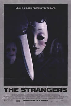
Yes, definitely. The subject matter is very precise and says much by showing little. You have the three protagonists, shrouded in darkness: a mystery, but the knife fortifies an ominous tone. The kewpie doll masks and the scarecrow sac-mask are ingenious: they can be interpreted in so many ways, yet visually command attention without any explanation.
Putting this on the poster, then toning it in such a gloomy way, really sells the film more than a more colorful, blatant visual.
For the film itself, it's worth seeing. Not perfect; but there are elements to it that are surprising coming from a first-time director. I would have left out the ending "explanation" part, and left more mystery in it. Very much like Them from 2006: sometimes clarifying just who's attacking you is contradictory to the mood you want to maintain. I'm not sure about the flashback approach, either. I think it tips the ending before the mayhem begins.
Posted by: ILoz Zoc | June 05, 2008 at 08:54 AM
>I won't call that poster a misuse of technology
Not really what I meant... misuse of technology to me translates into every movie poster nowadays looking like a boring collage. Classic era (pre-photoshop) posters were obviously created without computerized technology and filters, and relied upon the truer, stronger methods of time tested, handcrafted design, or painted. This Strangers poster is brilliant, even the typography shows a cleverness probably not displayed in the actual film itself.
Posted by: Steve | June 04, 2008 at 07:22 PM
Now, I won't call that poster a misuse of technology. It's too good. Let's say he wisely ignored the current trend.
Posted by: ILoz Zoc | June 04, 2008 at 11:17 AM
Wow, is that really the poster for The Strangers? I love the 70's style of design. I'm glad his art director misused modern poster design technology and went for this classic look instead, ha ha
Posted by: Steve | June 04, 2008 at 10:30 AM